Fliers, Brochures, and Newsletters
Small-format layouts can be very easily and quickly produced in ideal situations, and they can be hornets’ nests when too many people all try to direct the design or get their design agenda represented in such a limited format. I’ve produced these examples (and others) in both of those scenarios, and I’ve always come out reasonably satisfied. Other small-format work includes a bunch of magazine/online ads for Jones & Jones, but most of those were design-by-committee products or adaptations of inherited designs, and, upon consideration, none of them were sufficiently impressive that I’d put my name on them, so I’m not including them here (one’s included just as an example). But yes, I do ad design/layout as well…business cards too, etc.
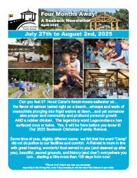
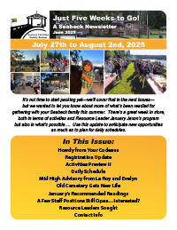
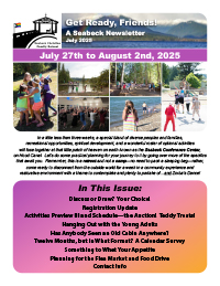
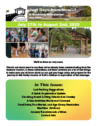
Seabeck Christian Family Retreat Newsletters
6-page 8.5" x 11" PDF newsletters (InDesign)
April–July 2025 | client: Seabeck Christian Family Retreat
I produced a sequence of four issues of an emailed PDF newsletter for the Seabeck Christian Family Retreat, featuring 100% content (no ads) written by four or five volunteer retreat staff and myself. I’m happy with my work on these newsletters, in large part because I designed them to build anticipation and was writing usually a third to a half of each myself and, in the last one especially, compiling a bewildering array of little updates into digestible groupings so that readers weren’t peppered from all sides at random.
In terms of graphic design, I utilized a bright rainbow-inspired color palette that was introduced as solid-color panel backgrounds for the first issue and evolved into spectrum gradients that culminated in almost tie-dyed backgrounds in the last one, subliminally building excitement for the experience ahead. I had the additional challenge of writing, as a nonreligious person myself, independently as the voice of a Christian entity…which I'm a good enough writer to do but still took a lot out of me to ensure that I got *right,* and I was at all times conscious of the imperative of being absolutely authentic in everything I wrote.

The Yorker
newsletter template remaster and issue layout (InDesign CS6)
2016–present | client: The York Neighborhood Association
As a nine-year resident of the York District of Bellingham, I’d wanted to give back to my neighborhood association, which produces and distributes a newsletter four to six times a year, and in the autumn of 2016 I got my chance. One of the pitfalls of all-volunteer organizations is that the ever-changing roster of persons involved generally prevents continuity and maintenance of materials such as this: one graphic designer uses one layout program while they’re on board, then someone else uses another when they take over, and sometimes the files don’t get carried over from one to another. The same with the ads used, sometimes, which can lead to some pretty unpleasant printed versions.
And that was essentially what I was encountering, but because I’m aware of how and why these things come to pass I was determined to get things in good shape on all fronts. And that meant, among other things, pinning down a layout template that had shifted in various ways over the years, in order to ensure that future issues would look more consistently familiar and, ideally, would have some features that neighbors would look forward to seeing in subsequent editions. I won’t have much say in the content programming of the Yorker*, but I can keep the layout looking good and foster relationships with current and potential advertisers to help keep the newsletter coming out so Yorkers will be kept informed about what’s happening around the neighborhood.
The printed edition is in black and white, but as the YNA makes the newsletter available on its website I did the main layout in color. And I was careful to enrich the digital experience of the newsletter with copious hyperlinks as appropriate—ads, emails, recommended websites all make it easy for the reader to follow up on what’s offered.
* Famous last words! In autumn 2023 I inherited the role of Editor when our most recent newsletter lead moved out of town for law school. This means I now am responsible for its entire production and distribution. Hoo-boy….

Big Brothers Big Sisters brochures, flyers, reports, and marketing collateral
various formats
July 2011–2014 | client: Big Brothers Big Sisters of Puget Sound
Although currently I only help with their website, I spent four years providing marketing-graphics production for BBBSPS, which was great because not only are they lovely folks to work with but also it meant collaborating again with my former Jones & Jones colleague Pam Shields (who has since moved on to be the executive director at Big Brothers Big Sisters of Snohomish County, for whom I now obliquely produce marketing graphics for the Dream Builders Car Show, run by one of their former Little Brothers to raise funds for them). I completed dozens of products for them—everything from event signage to Donation Center receipts. The national Big Brothers Big Sisters organization established a fairly strong but flexible style guide last year which I consult each time I revise an existing marketing-collateral piece or design a new one for BBBSPS.
Almost all of the work we do together is arranged via email, with an occasional phone call to elaborate or discuss details, and larger files are transferred via my own FTP site.
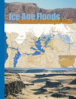
Ice Age Floods National Geologic Trail brochure
4-page 8.5" x 11" brochure (InDesign CS2)
January–February 2009 | client: Ice Age Floods Institute (for Jones & Jones Architects and Landscape Architects, Ltd)
The Ice Age Floods National Geologic Trail was being put to the U.S. Congress for funding/approval in February 2009 and the Ice Age Floods Institute asked Jones & Jones if we could help them quickly develop a simple new informational flyer with updated graphics to give the project a last compelling push in this last round of its journey. With a little back-and-forth refinement of my initial design, we wrapped it up pretty fast. And not only did Congress approve the project, but we had requests for more copies of the flyer from various Senators’ offices.

Jones & Jones ad for First Alaskans magazine
3.65" x 4.75" advertisement (InDesign CS3)
January 2009 | client: Jones & Jones Architects and Landscape Architects, Ltd
As mentioned above, I did many ad layouts for Jones & Jones but none particularly noteworthy due to the circumstances of their production (usually design-by-committee affairs). This is one I feel I can safely show: the fundamental design is an adaptation of their then-recently-completed rebranding process and a previously-adopted style based on the cover for Spacemaker Press’s Landmarks book Living Places: The Architecture and Landscape Architecture of Jones & Jones (2006) by Clair Enlow. We adapted the layout for another publication, as I recall, and probably for signage for some convention booth or other. Obviously that template, once established, is infinitely repeatable as long as you have sufficient-quality photography or other graphics to plug into the appropriate spot, and that’s pretty much what’s been happening with that design since then, for various publications.
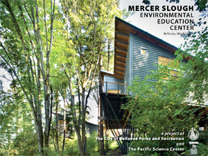
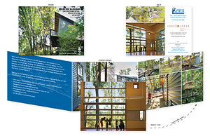
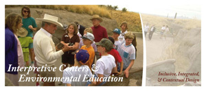
Mercer Slough Environmental Education Center brochure
5.83" x 4.37" brochure (InDesign CS2)
November 2008 | client: Jones & Jones Architects and Landscape Architects, Ltd
This was a little promotional piece for Jones & Jones, not for the project clients (the City of Bellevue Parks and Recreation Department and the Pacific Science Center), showcasing the built project as illustrated so excellently by the photography of Lara Swimmer. In fact the photographs were so superb that there was very little to do but put a few bits of information and identifying captions around them and call it done.
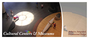
Cultural Landscapes/Centers/etc. brochures
8.5" x 11" tri-fold brochures (InDesign CS2)
Summer 2005 | client: Jones & Jones Architects and Landscape Architects, Ltd
Following up on the “Brownfields Into Green Infrastructures” brochures below, the design was tossed back and forth between various colleagues, and by the time it returned to my hands it had developed a clunky and angular format which I truly did not care for. I proposed a smoother, sleeker style which encouraged the recipient to open the brochure and continue exploring its contents.

The debate over design of such materials at Jones & Jones can go on endlessly and turn into “design by committee” pieces all too easily; this was in some ways one of those situations. The resulting format resembles my design enough for me to include it here, advisedly, but when it was later adapted for use as display boards for a conference and (regrettably) a window display for the American Institute of Architects’ Seattle office it was being distorted to the point where I simply wouldn’t want my name associated with it even if I was technically doing the layout.
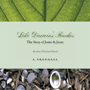
Like Darwin’s Finches—The Story of Jones & Jones (A Proposal)
9" x 9" book proposal, 38 pages (InDesign 2.0.1)
Summer 2004 | client: Jones & Jones Architects and Landscape Architects, Ltd
As in the case of the “Gorillas, Bears, Elephants, People” brochure (see below), this was one of the rare projects in which Jones & Jones gave me complete artistic freedom. Specifically I was given only text for a proposed book on the company’s 35-year history, the text consisting of chapter introductions by the proposed author, Anne Elizabeth Powell (currently editor of Civil Engineering magazine); the powers-that-be at Jones & Jones knew that I was familiar with the breadth of the company’s substantial image bank and would select the images most appropriate for the text and the company’s story.
This PDF is essentially the first draft I presented to the principals, with two images and a couple of captions added but no significant changes made. It’s clean and safe, for the most part, if elegant, but that’s an appropriate look for the company.
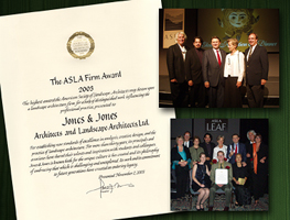
ASLA Award Commemoration
5.25" x 4" photograph (Photoshop 7)
December 2003 | client: Jones & Jones Architects and Landscape Architects, Ltd
After I on a whim produced a poster for in-house commemoration of Jones & Jones receiving of the American Society of Landscape Architects’ first annual ASLA Firm Award in November of 2003, I was asked to adapt the design for use both online and, in this case, as a photograph to be tipped into the firm’s annual end-of-the-year holiday card.
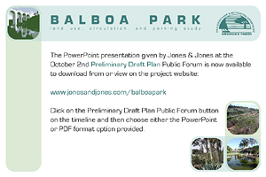
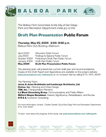
Balboa Park Land Use, Circulation, and Parking Study: Findings & Options White Paper
8.5" x 11" flyers + 6" x 4" postcards (FreeHand 10)
2003—2004 | client: City of San Diego Park & Recreation Department (for Jones & Jones)
Implementing the overall design I created for this project, these flyers and postcards have been distributed and mailed to various Balboa Park stakeholders and community members to encourage public contribution to the Study.

Gorillas, Bears, Elephants, People: The Evolution of a Zoo Exhibit Design Philosophy
5.5" x 8.5" brochure, 12 pages (FreeHand 10)
September 2003 | client: Jones & Jones Architects and Landscape Architects, Ltd
Given a marvelous essay by zoo expert David Hancocks, showcasing the transformation of Woodland Park Zoo’s gorilla exhibit/habitat as well as similarly ground-breaking projects at Detroit Zoo and Melbourne Zoo, I created this promotional brochure to be distributed at the American Zoological Association’s annual convention in September of 2003. The design is entirely my own.
ASLA Award Announcement
8.5" x 11" flyer (FreeHand 10)
September 2003 | client: Jones & Jones Architects and Landscape Architects, Ltd
I was asked to create a simple, emailable promotional flyer to announce that Jones & Jones was to be awarded the American Society of Landscape Architects’ first annual ASLA Firm Award, and although my design was approved the announcement was never made.

Brownfields into Green Infrastructures
8.5" x 16" quad-fold brochure (FreeHand 10)
March 2003 | client: Jones & Jones Architects and Landscape Architects, Ltd
This design collaboration with landscape architect Nate Cormier began as a brochure in March of 2003 and was adapted for web use in November, finally appearing as a Flash animation leading to a standard project feature page on the Jones & Jones website.
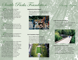
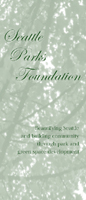
Seattle Parks Foundation Brochure
11" x 8.5" tri-fold brochure (FreeHand 8)
June 2001 | client: Seattle Parks Foundation
One of the Jones & Jones principals “volunteered” me to design a brochure promoting the Seattle Parks Foundation, and this little low-key trifold was the result.
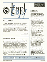
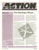
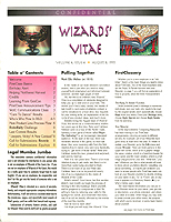
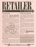
Retailer Direct, Wizards’ Vitae, Piece of the Action, and Tap! newsletters
1995–1996 | client: Wizards of the Coast
In January of 1995 I was tasked by this international game publishing company’s Public Relations Director with creating an entire corporate newsletter effort, producing monthly newsletters targeting gamers, retailers, and company shareholders, and doing so as quickly as possible. I started with Retailer Direct, because there was at the time an urgent need to reassure retailers of the Magic: The Gathering™ products that the recent oversupply of product didn’t mean the end of the boom, and at the same time we wanted to establish a connection with them and give them a monthly supply of reliable news about the company and its products. From the start I wrote and edited copy, coordinated publication schedules, and (after the initial issue) did the layout for Retailer Direct, eventually producing around 15 issues during my time at Wizards.
As the initial crisis faded and time permitted, I then created the in-house monthly newsletter Wizards’ Vitae, for which I wrote much of the content and directed with great vigor. When I was at last given some actual staff to assist me in this newsletter effort, I developed two more newsletters, targetting player associations in the case of Tap! and company shareholders with Piece of the Action, in close collaboration with two new team members, and after the first issue of each I pretty much stepped back to let them run it, filling essentially an advisory role thereafter.
My biggest regret with Retailer Direct is that I wasn’t much of a graphic designer at the time and therefore didn’t have a very good masthead (it was designed by someone else), so that damned ugly one stayed on the newsletter for my whole Wizards tenure.
Comments © 2009 Mark Ellis Walker, except as noted, and no claim is made to source imagery noted.