Project Design & Logos
These are some projects for which I designed thematic elements such as the overall color scheme/palette, the general graphic identity, or multiple formats, as well as ones in which I directed the production of consistent products. Also there are a smattering of logos I’ve produced…although certainly not all.
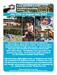
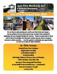
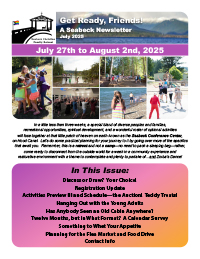
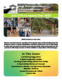
Seabeck Christian Family Retreat Newsletters
6-page 8.5" x 11" PDF newsletters (InDesign)
April–July 2025 | client: Seabeck Christian Family Retreat
I produced a sequence of four issues of an emailed PDF newsletter for the Seabeck Christian Family Retreat, featuring 100% content (no ads) written by four or five volunteer retreat staff and myself. I’m happy with my work on these newsletters, in large part because I designed them to build anticipation and was writing usually a third to a half of each myself and, in the last one especially, compiling a bewildering array of little updates into digestible groupings so that readers weren’t peppered from all sides at random.
In terms of graphic design, I utilized a bright rainbow-inspired color palette that was introduced as solid-color panel backgrounds for the first issue and evolved into spectrum gradients that culminated in almost tie-dyed backgrounds in the last one, subliminally building excitement for the experience ahead. I had the additional challenge of writing, as a nonreligious person myself, independently as the voice of a Christian entity…which I'm a good enough writer to do but still took a lot out of me to ensure that I got *right,* and I was at all times conscious of the imperative of being absolutely authentic in everything I wrote.
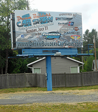
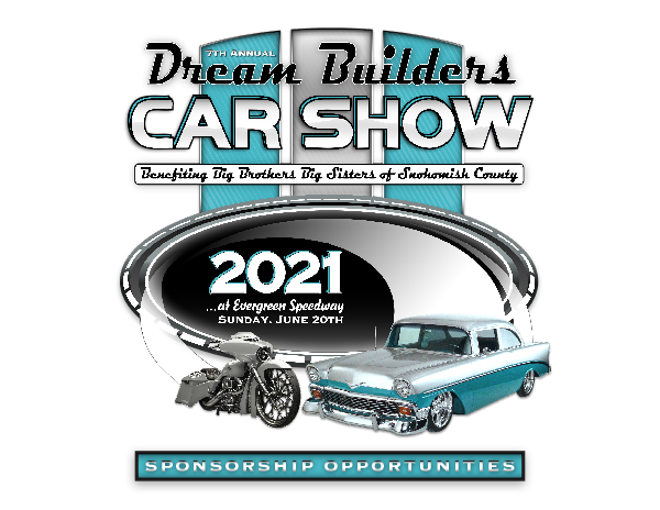
Dream Builders Car Show
logo reconstruction/updates, signage, promotional materials, ancillary logo designs, and webmastering
December 2015–2025 | client: Dream Builders Car Show
In 2015 Big Brothers Big Sisters of Snohomish County had worked with super-supporter Steve Myers (himself a former Little Brother) to produce promotional materials for Steve’s Dream Builders Car Show fundraiser (from which the money raised is donated to Big Brothers Big Sisters) in-house but had found the additional workload overwhelming, so as Steve began preparing materials for the 2016 event (the third annual one) they asked if I would take it on in an on-call capacity. I inherited the general show logo from the previous years but was asked to improve it and extend that design out to various other pieces appropriately, which necessitated reconstructing it from scratch.
Since December 2015, we’ve produced everything from business cards to a billboard (my first!—I’d done truck wraps before, but this was my first stationary piece of this size), including posters, flyers, yard signs, banners, T-shirts, trophy plaques, and event signage, as well as a sponsorship-pitch booklet, incorporating sponsors’ logos in many of these. I also maintained the show’s website and kept Steve supplied with web-ready versions of all the graphics for use on his social-media sites.
And I’m delighted to note that the 2023 event (the ninth so far, and my seventh) was the Gold Best Charity Event of 2023 winner of the Seattle Times’s Best in the PNW people’s-choice awards!
We’ve had a good time working on these. In fact, in January 2019 I received a delightful report from our main contact at K&H Print Solutions, the company that has printed many of these pieces and also supports Big Brothers Big Sisters of Snohomish County, noting with regard to a sponsorship-recruitment booklet I had produced that two of her coworkers had declared that they were now planning to attend the show upon having seen their test print of our booklet. I guess I done good!
In addition to all the main show graphics and promotional materials, I’ve also produced logos for VIP participants’ distinction—designs unique to each year’s event and generally referencing the main show logo’s palette and patterning. My personal favorite of these was for the 2023 event, when I wanted to pay homage to something dear to me that was being demolished and had a flash of insight as to how I could do so via the VIP logo. Usually Steve and I collaborate closely on the design for these, but in this case I knew I had nailed the design on the first draft (which, admittedly, isn’t all that unusual for me) even before he enthusiastically approved it (I’ll probably eventually write out more about what the design represents, because I really am proud of the result, but this will do for now.)

The Yorker
newsletter template remaster and issue layout
2016–present | client: The York Neighborhood Association
As a nine-year resident of the York District of Bellingham, I’d wanted to give back to my neighborhood association, which produces and distributes a newsletter four to six times a year, and in the autumn of 2016 I got my chance. One of the pitfalls of all-volunteer organizations is that the ever-changing roster of persons involved generally prevents continuity and maintenance of materials such as this: one graphic designer uses one layout program while they’re on board, then someone else uses another when they take over, and sometimes the files don’t get carried over from one to another. The same with the ads used, sometimes, which can lead to some pretty unpleasant printed versions.
And that was essentially what I was encountering, but because I’m aware of how and why these things come to pass I was determined to get things in good shape on all fronts. And that meant, among other things, pinning down a layout template that had shifted in various ways over the years, in order to ensure that future issues would look more consistently familiar and, ideally, would have some features that neighbors would look forward to seeing in subsequent editions. I won’t have much say in the content programming of the Yorker*, but I can keep the layout looking good and foster relationships with current and potential advertisers to help keep the newsletter coming out so Yorkers will be kept informed about what’s happening around the neighborhood.
The printed edition is in black and white, but as the YNA makes the newsletter available on its website I did the main layout in color. And I was careful to enrich the digital experience of the newsletter with copious hyperlinks as appropriate—ads, emails, recommended websites all make it easy for the reader to follow up on what’s offered.
* Famous last words! In autumn 2023 I inherited the role of Editor when our most recent newsletter lead moved out of town for law school. This means I now am responsible for its entire production and distribution. Hoo-boy….
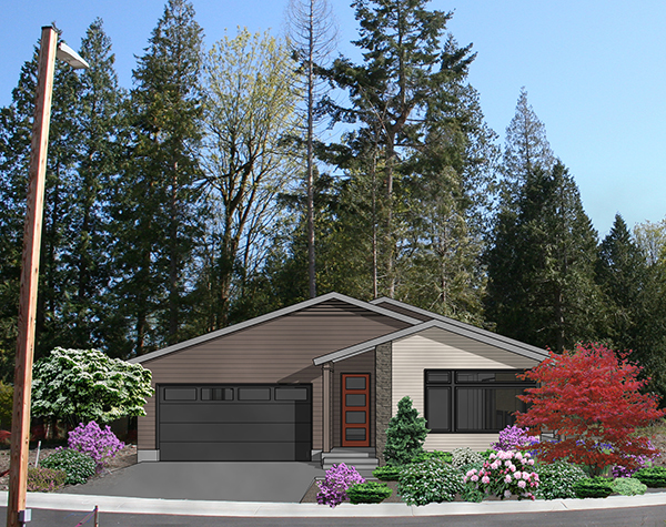
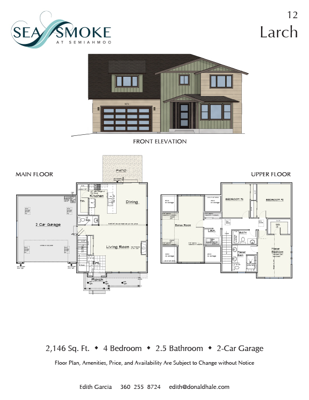
Sea Smoke Support Projects
2017–2021 | client: Rimland Pacific, on behalf of the Sea Smoke Homeowners Association
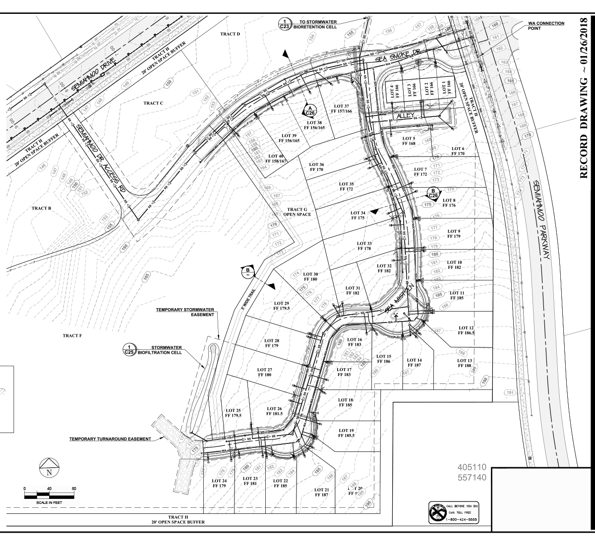
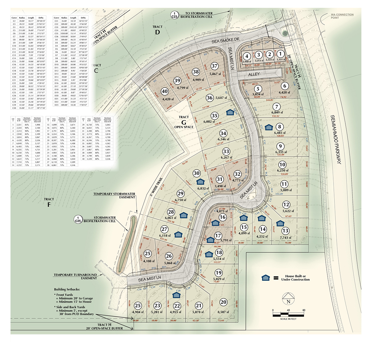
Wayne Schwandt of Bellingham-based developers Rimland Pacific, for whom I’d produced a logo and some Google Earth-resident building simulations around 2013, asked me to do a couple of signs in July 2017 and January 2018 to promote their planned-community Sea Smoke Neighborhood project, located on the headland above Semiahmoo Spit. The first was a simple promotional sign featuring a map of the available plats and renderings (not by me) of sample house designs, and the second was an interpretive sign for a stormwater-filtering bioretention pond near the site.
Since those projects, I have also produced (with Rimland Pacific and subsequently some Realtors marketing the properties) a photosimulation of how one not-yet-built house would look when its landscaping was fully grown in (shown at right), a colorized rendering of the site plan (for which I had as my sole source matter a very detail-layered record drawing in PDF form that I then deconstructed and rebuilt in Illustrator, shown below in Before and After forms), ads, brochures, and flyers (among them, as shown below at left, Realtors’ house listings featuring colorized-by-me elevation drawings of the various house designs on offer, along with visually improved versions of their floor plans that would read better for general consumption).
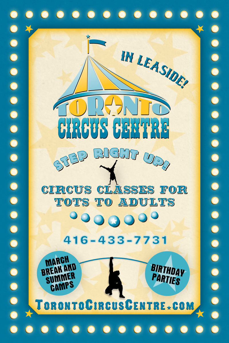
Toronto Circus Centre
logo and promotional materials
November 2016 | client: Toronto Circus Centre
A longtime pal tapped me to get her friend Jen Georgopolous set up with a logo and promotional postcard for Jen’s new circus school, which opens in January. And we had a ball coming up with them, even though we’re 2,000 miles apart. Jen supplied the name, the color palette, typefaces she felt conveyed the circus mood she was looking for, and the idea of possibly a tent viewed from above as part of the logo; from there, after an initial couple of draft designs from me, we refined things pretty quickly into the final logo form.
For the postcard, and subsequent signage based on it, I just kept rolling with the motifs we’d been discussing, plus I created some silhouettes to illustrate activities Jen wanted to show (including one of her performing with acrobatic silks).
Still Life Massage
logo, signage, and stationery
March–May 2012 | client: Still Life Massage
Shannon Fuller was opening her own massage clinic in May 2012 and asked me to design a logo for the business; I had come to know her and her husband Tim when he was a waiter at a local restaurant I frequented regularly, and I had showed them examples of my work on a few occasions while visiting or dining. We did most of the back-and-forth development and refinement of ideas by email, but the last big push to get the logo happened in their kitchen, where we were able to try out potential adjustments real-time on my laptop. The project didn’t quite end there, because when she got her first sign printed (a sandwich-board number to stand outside the business) she felt the name was too small and got lost in the white space. So I revised it to beef up the name considerably but still balance it with the sequence of ellipses (which were intended, by the way, to convey a sense of relaxation in their descent from tight green dot to flattened tranquil blue pool), and, although I personally prefer the original version, it’s certainly true that the sign is more immediately eye-catching and readable in the later form.
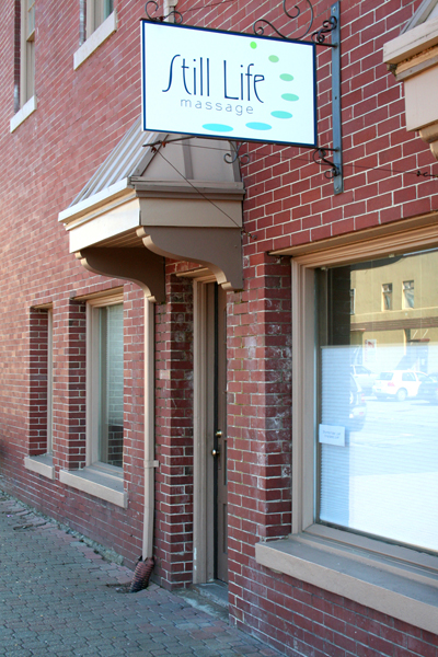
Here’s her hanging sign, at 120 Prospect Street in downtown Bellingham (between the new and old museums):
(Later it was noted by a friend that the logo bears some resemblance to my original design of a website I did a decade ago [viewable on my Website page of this portfolio]. That is just a funny coincidence: the ellipse sequence in my original Still Life design was a standing arc, top to bottom, and it was Shannon who suggested rotating it to cup the name.)
Pôle Science et Santé
logo
2010 | client: Oger International
Someone I knew at Oger’s complex just north of Paris asked me to produce a logo for a newly formed interdepartmental team focused on health-science projects and info sharing. He wanted it to evoke a neuron, although it also needed to feature the dusky blue octogon from Oger’s logo. This was the result, with French, English, and Arabic versions.
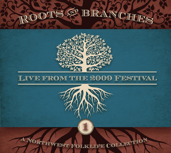
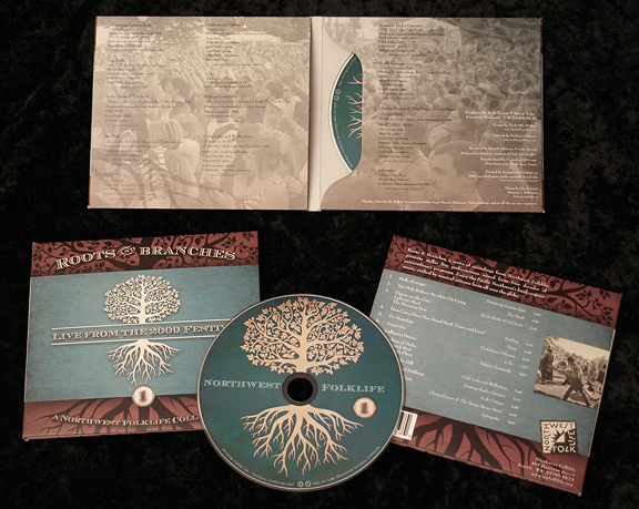
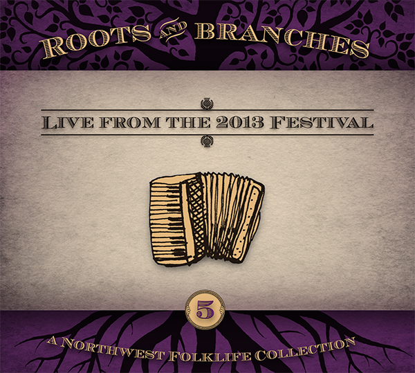
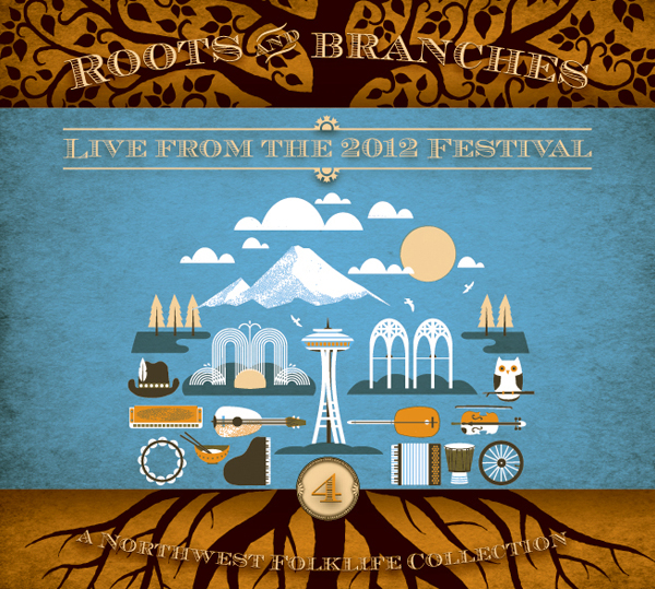
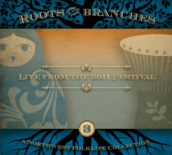
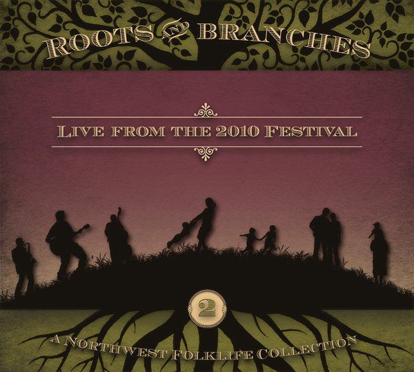
“Roots & Branches” CD series
CD packaging (Illustrator CS3)
October–November 2009 + 2010 + 2011 + 2012 + 2013 | client: Northwest Folklife
What’s shown here is the inaugural release of Northwest Folklife’s new “Roots & Branches” series of recordings from their Folklife Festivals (held at Seattle Center each Memorial Day weekend), followed by four subsequent years’ releases. I produced this design in Bellingham, in conjunction with producer Kelli Faryar in Seattle, with series-long elements framing release-specific artwork and information. We were extremely fortunate to have the superb tree illustration by Nathan Goldman to use as both the kickoff art (adapted from the 2009 festival’s poster) and as the series-spanning background elements. My design for this was actually more richly colored than appears here: somehow in the printing process the spot inks used came out much more pale than was intended, so I’ve adjusted the digital thumbnail here to match. As for the rest of the design, the typeface used for the tracklists and credits wasn’t my choice, as it’s too thin-bodied to be reliably readable, but thankfully it printed crisply enough (at least in its white form, which is the hardest to align precisely in a four-ink printing).
In September/October 2010, Kelli adapted the first year’s layout with new imagery and consulted me for the refinement and wrapup, and I sent the files to the offset print house myself as separations this time, just to be thorough. The result was much stronger-looking, as the printers used more of a gloss finish which really beefed up the black ink layer. The 2011 and 2012 releases were my own design, again drawing specifically on the artwork created for each year’s festival. I loved working with Kelli on these!
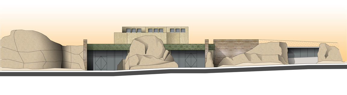
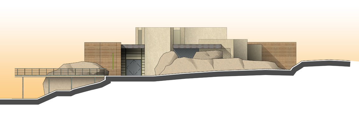
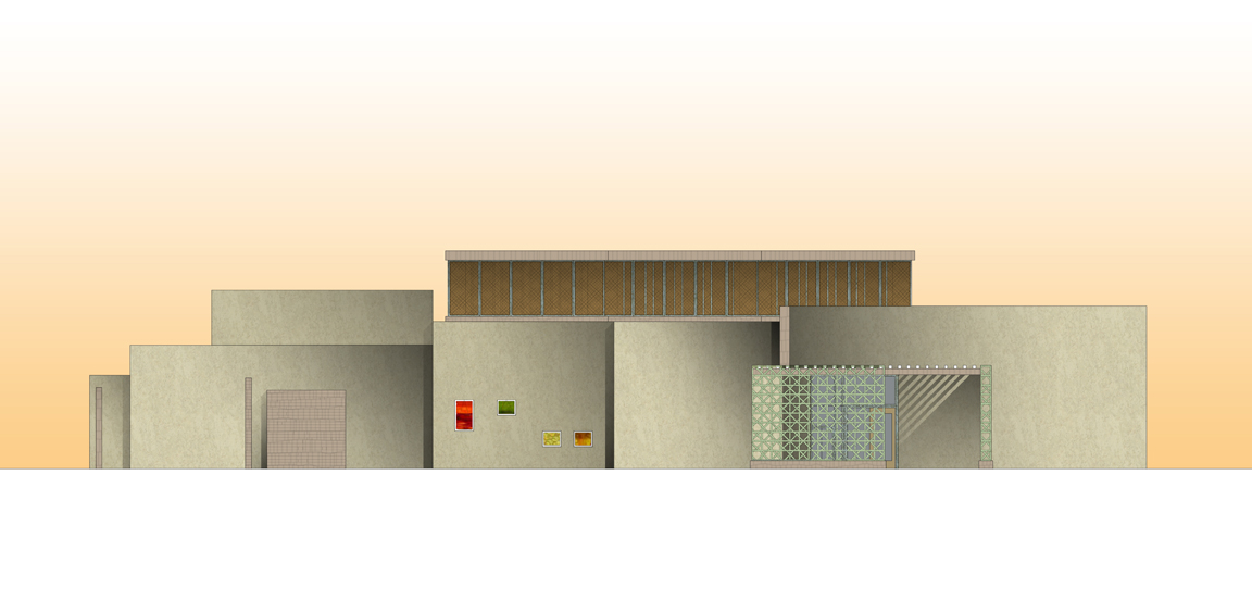
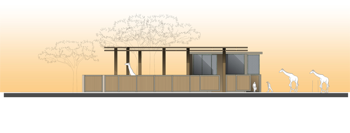
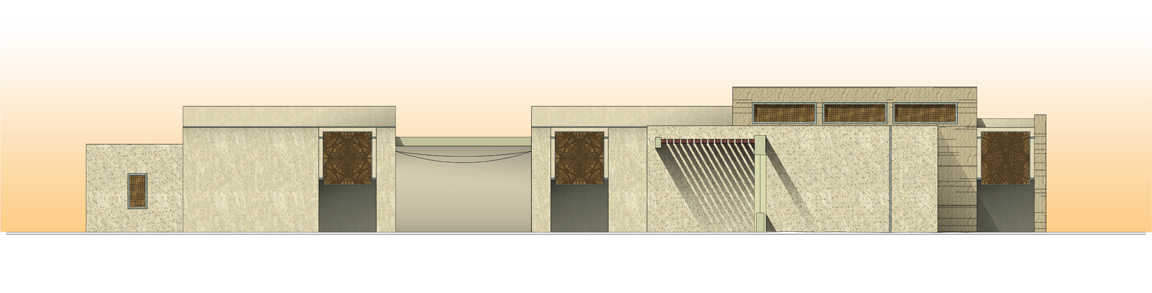
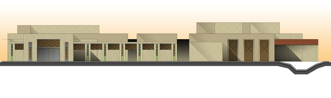
Al Ain Wildlife Park and Resort (متنزّه العين للحياة البرية) Materials Illustrations
illustrative renderings (Photoshop CS2)
April 2009 | client: EDSA (for Jones & Jones)
Perhaps these illustrations aren’t quite appropriately categorized here, but I’m putting them on this page because it was a series of consistent renderings produced with a tricky palette under very rapid-fire circumstances on a truly sprawlingly huge project to be built in the United Arab Emirates (see my rendering of the site plan for more on this). For the most part I was working on them with just one other person (usually an architect who would supply me with AutoCAD output and then discuss and refine with me the effects being implemented). We were working to some mighty tight deadlines on these, producing a series of what was initially described as a few but eventually exploded into an array of 27 illustrations, each to be printed at up to 36" width, and I was doing it all from Bellingham with colleagues in Seattle. In that sense it was an excellent example of how telecommuting can totally work…especially as I could be working on one architect’s illustration while talking through a rendering assignment with another on the phone; on-site, in person, it’s actually harder to multitask productively than it is this way. And I am great at multitasking responsibly and with superb organization and accountability.
E2 Beauty
logo
November 2005 | client: Elizabeth Lindquist & Elizabeth Finan
The two Elizabeths asked me to help them establish a corporate identity for a glamour/beauty-application business they were concocting jointly; we met, we doodled, we talked a lot, and we had copious libations and bitched about everything and everyone, and over a few days I provided them with some design concepts which we discussed via email. In the end they went for a form of my logo design I wasn’t thrilled with, instead of the one I thought was Just Right; I provided it and immediately erased it from my mind, so even now I’m not sure which of the “final” versions they finally went with, and as a result I’m only showing the one I preferred above all. (I know the version they chose featured a bottom eyelash which had appeared in an early draft, but I felt it weakened the design.)
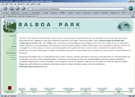
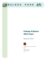
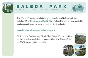
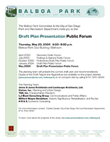
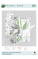
Balboa Park Land Use, Circulation, and Parking Study
8.5" x 11" report, 43 pages (PageMaker 6.5)
8.5" x 11" flyers + 6" x 4" postcards (FreeHand 10)
30" x 42" presentation boards + 11" x 17" handouts (Photoshop 7 & FreeHand 10)
website
October 2003 | client: City of San Diego Park & Recreation Department (for Jones & Jones)
The second White Paper produced for Jones & Jones’s Balboa Park study fairly well embodied the style of the design I had created in April for the overall project. The elements I established for the Study included reports, meeting-announcement flyers and postcards, presentation boards, and a website; the logo/crossed-rectangles structural theme was jointly developed with architect Nate Cormier. I also produced all of the conceptual site plans at this stage, alternately in Freehand 10 and Photoshop 7 as the Principal-in-Charge required different effects to be implemented. The most recent report produced for this Study, the “Preliminary Final Draft,” involved a layout of 171 pages; the design has now been converted to InDesign 2.01 format.
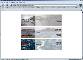
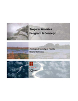
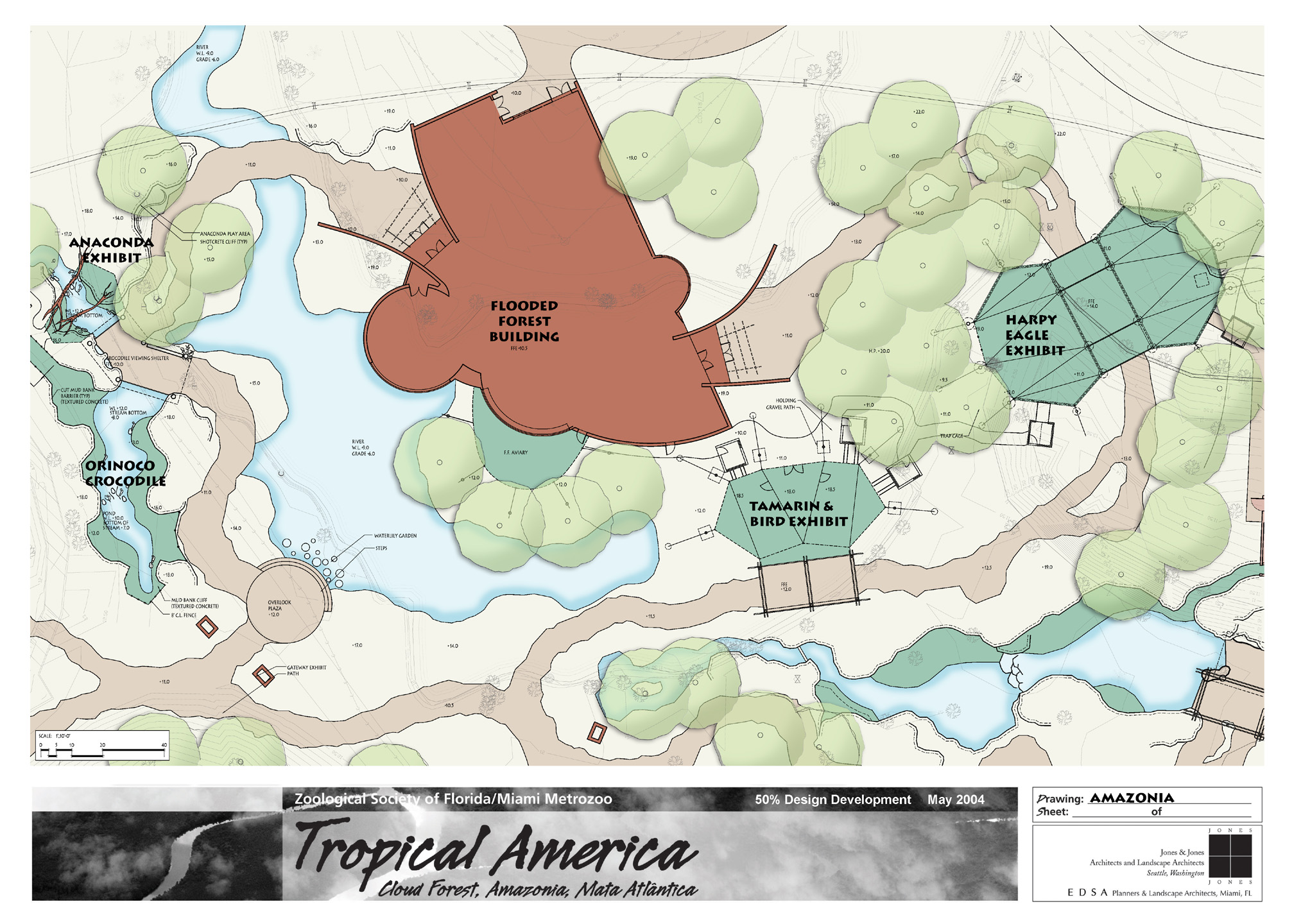
Tropical America Program Document, website, and plan colorization
8.5" x 11" report, 160 pages (PageMaker 6.5)
website
42" x 30" panels (PageMaker 6.5)
July 2003 | client: Miami Metrozoo (for Jones & Jones)
I designed the 160-page Program Document’s color scheme and wayfinding elements to facilitate easy navigation through the massive content. After the report was delivered to the client, I produced a website version of it, which was later transformed into a resource page to show the client Jones & Jones’s current project status and products before being retired when the project was completed; the website retained the navigation scheme of the original document.
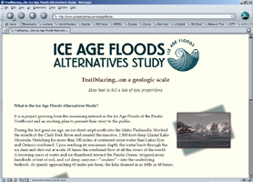
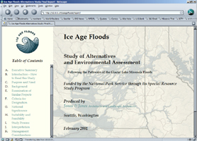
Ice Age Floods Alternatives Study
logo, website, and visual identity
March 1999 | client: National Park Service (for Jones & Jones)
Once it was decided that the Ice Age Floods study, facilitated by Jones & Jones, should have a sort of “corporate identity” of its own to help catch the public’s attention for what might otherwise seem an academic or specialized project, I designed the logo and set the color palette and titling font which all defined the project’s public look all the way through to the final report which was delivered to the U.S. Secretary of the Interior in September of 2001. I also created the Study’s initial-phase website, which at the conclusion of the Study was replaced with a site presenting the Final Report in web-page form (which I also built). As Graphic Designer I was one of the recepients of the ASLA Honor Award for Communications the project team was given in 2001.
RST Enterprises
logo
1999 | client: Rob Thomas
My friend Rob asked me to design a corporate logo that would convey the sense of powerful remote-control centralization that a product he was developing would have. I rather liked the result, as did he.
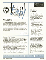
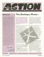
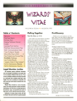
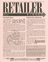
Retailer Direct, Wizards’ Vitae, Piece of the Action, and Tap! newsletters
8.5" x 11" newsletters (QuarkXPress)
1995-1996 | client: Wizards of the Coast
In January of 1995 I was tasked by this international game publishing company’s Public Relations Director with creating an entire corporate newsletter effort, producing monthly newsletters targeting gamers, retailers, and company shareholders, and doing so as quickly as possible. I started with Retailer Direct, because there was at the time an urgent need to reassure retailers of the Magic: The Gathering™ products that the recent oversupply of product didn’t mean the end of the boom, and at the same time we wanted to establish a connection with them and give them a monthly supply of reliable news about the company and its products. From the start I wrote and edited copy, coordinated publication schedules, and (after the initial issue) did the layout for Retailer Direct, eventually producing around 15 issues during my time at Wizards.
As the initial crisis faded and time permitted, I then created the in-house monthly newsletter Wizards’ Vitae, for which I wrote much of the content and directed with great vigor. When I was at last given some actual staff to assist me in this newsletter effort, I developed two more newsletters, targetting player associations in the case of Tap! and company shareholders with Piece of the Action, in close collaboration with two new team members, and after the first issue of each I pretty much stepped back to let them run it, filling essentially an advisory role thereafter.
My biggest regret with Retailer Direct is that I wasn’t much of a graphic designer at the time and therefore didn’t have a very good masthead, so that damned ugly one stayed on the newsletter for my whole Wizards tenure.
Comments © 2007–2012 Mark Ellis Walker, except as noted, and no claim is made to source imagery noted.