Abstract Illustration
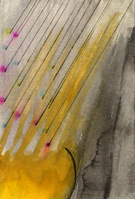
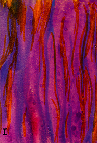
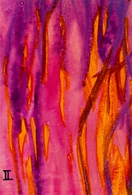
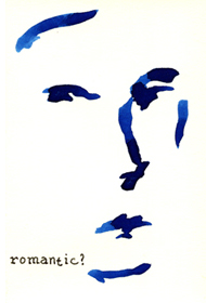
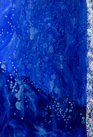
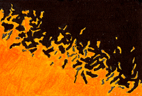
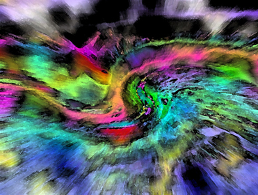
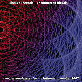
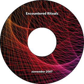
From time to time I do looser, more abstract illustration—sometimes by hand, sometimes digitally, and sometimes a mix of both methods. Usually these have been for mix tapes and CDs for myself and family…it’s not a major arm of my design work, more of an indulgent hobby which time rarely permits, but I’ve decided to include some samples here to show that I’m not strictly a hard-geometric-lines kind of designer and that I can produce inherently expressive elements such as these.
I also have done some project-specific site photography, using my Canon Digital Rebel XT camera. While most of those examples are more functional than compelling, in the context of this portfolio, I have included as the first item a recent example which combines photography and layout/design.
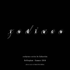
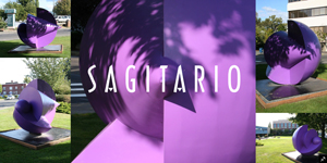
Zodiaco
digital brochure (InDesign CS3)
2010 | client: myself
Twelve Zodiac-themed sculptures which jazzed up some of downtown Bellingham’s streets in the summer of 2010 were created in recent years by Chihuahuan artist Sebastián (Enrique Carbajal González) and brought to Bellingham by the efforts of the Sculpture Northwest association. When I read in August 2010 that these sculptures were only a temporary installation, I felt an urgent need to document their “moment” here. Places that are temporarily transformed have additional mystique, both to those who are present to see the alternate version in person and to others who learn of them afterward, and photography is crucial to providing a glimpse to the latter of what the former experienced. When I showed a quick assortment of these photos to a friend on the other side of the globe, they completely failed to make an impression…so I arranged them in a gallery that would emphasize the visual impact of each sculpture but also show it in its temporary local context.
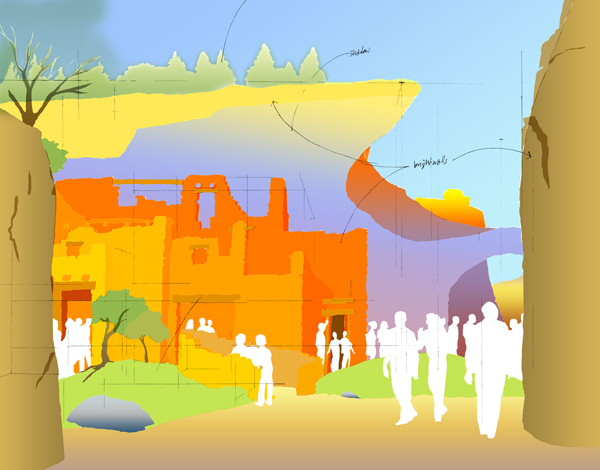
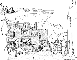
Bergen County Zoological Park—Proposed Canyon Country Exhibit illustration
illustration (Photoshop CS2)
2006 | client: Jones & Jones Architects and Landscape Architects, Ltd
One of the Principals at Jones & Jones came to me one day with a one-off request to color a line-drawing illustration by Seth Seablom, one of the company’s regular illustrators; although they were having Seth do a “natural”/realistic coloring job on this illustration when the linework had been finalized, this Principal wanted to see something wildly different in addition—not to represent the project per se but rather to exist as a standalone piece, perhaps to use as a holiday-card insert (which I think we did use it for eventually). I roughed in a few fairly intense colors here and there and said “along these lines?” “More,” he replied. Eventually I took it to this extreme by thinking of some early 1970s California-rock album art. Most of the time it took to create this consisted of building the illusion of depth—organizing the layers and assigning relative light/intensity hierarchy—and then going back and forth with that Principal to adjust elements he wanted to emphasize. It’s a quirky piece, especially as we left it in this draft-like form, with the only linework retained being rough notations and guides.
Comments © 2009 Mark Ellis Walker, except as noted, and no claim is made to source imagery noted.