Online Features
Website design is not my focus, but I do it from time to time. Mostly it’s not my focus because my own preference in website design is for clean, simple, straightforward sites that are not hugely graphics- or interface-dependent: I want a website to make information readily available to me, not to give me an “experience,” in most cases anyway, so I’ve not attempted to master cutting-edge techniques. I do build some website elements in Flash, but otherwise I’m rather “old school”—I use Dreamweaver only to speed up some parts of website construction, often simply typing raw HTML code myself because I’m so used to doing it (my first website design was circa 1996). As with the other sub-pages of my portfolio, these are not all of my web/online designs…just the ones I felt were of specific interest here.
The temporal relevance of websites being what it is, most of these sites are no longer “live;” therefore some examples aren’t actively linked anymore.
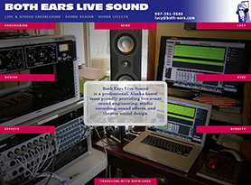
2013 | client: Both Ears Live Sound
My friend Lucy Peckham and I met in 1984. When she asked me in 2012 to design a website for her already-existing but not-really-promoted business (sound engineering, effects, and design), I was delighted to take up the challenge of creating something new to publicize work she and her colleagues were already doing…but in addition I wanted to personalize the business, to interweave the personal and the professional aspects of their work, because the nature of their work is so intrinsically enhanced by what each of the three partners in the business bring to each project.
We had the great fortune of being able to work in person, at times with her Both Ears partner Mike Sakarias, at my house here in Bellingham during her visits to town this summer (which also involved some fruitful and very enjoyable visits to “Spark,” as the American Museum of Radio and Electricity now brands itself); this in-person time allowed me to pump Lucy’s brain for free-flowing thoughts on their work, with me acting as amanuensis because I’m a faster typist than anyone else I know, but also acting as Producer in the way that I admire Dave Stewart of Eurythmics for: encouraging and immediately enabling creativity, with concrete reviewable results that further encourage confidence and willingness on the part of all involved to continue the flow.
This was also a refreshing project for me because, as with Cat Grey’s website (see below), it was an opportunity to create a unique and personable website that was not just another WordPress blog-structured website-in-a-can product. I talked at length with Lucy about what their work represented, meant, and entailed, to her, and what their clients and associates valued in what they got from working with Both Ears Live Sound. Plus which I got to delight in what Lucy and Mike and Bennett had to celebrate about their work and their interests…especially nice for me, as I’ve rarely lived in the same city as Lucy and therefore haven’t often gotten to experience her work and her joy in it.
The site was refined and populated with each of us in different cities—myself in Bellingham, Lucy in Anchorage and sometimes Seattle, Mike in Juneau and sometimes Port Townsend. I do enjoy being able to collaborate so effectively via email and the immediacy of the Internet, and this project has indeed been a joy to work on. Still is!
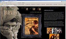
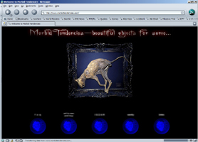
2012 | client: Acataphasia Grey
The original website of Morbid Tendencies and the International Society of Animal Recyclers (ISOAR) was designed and built while the artist was in Florida and I was in Washington, in 2002; we created the design via email discussions. In 2012 year, we decided the time was overripe for it to be updated with a new focus, specifically to showcase her taxidermic art and to enable online sales of smaller pieces. It came out very nicely, I thought…more compact, easier to navigate, more visually striking than the first version had been.
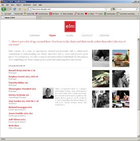
May 2011 (+ May 2012) | client: ELM
I was asked by my former Jones & Jones colleague Chris Overdorf to create a new website for the Jacksonville-based company he was joining as they expanded their presence to include a Seattle office as well as a network of consultants (myself included) in other cities. Although I hadn’t designed a full website since that of Jones & Jones’s own 2008 makeover, I was happy to take on the project. And it was fascinating to produce this entirely remotely, working with people in both Jacksonville and Seattle via telephone, email, and web conferencing. The rollout date was moved up by a couple of weeks in order to allow them to start marketing their new identity right away, so there are still a couple of elements being built in the background for later implementation, but it’s a good start.
One aspect of the site design and construction that we didn’t fully resolve is the plethora of website-viewing devices currently in use, and how to optimize the site for any of them…a challenge I’m not convinced can be resolved. One reason I don’t market myself as a web designer (whether of sites or merely graphic elements) is that I don’t use those devices—iPads, tablets, cellphone interfaces, etc.—and have no wish to do so; it’s just not my world. There are plenty of people out there who do care about such things and can design for them; I’m “older-school” and I know it.
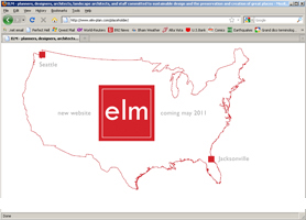
Similarly, Chris asked me to create a placeholder page while we readied the rest of the site, so he could begin emailing people from the new domain name and have something in the website’s future home. He and a couple of the Jacksonville guys submitted a few ideas to me, and I took one—that of an outline of the U.S., with ELM’s logo’s red square indicating the locations of Seattle and Jacksonville—and ran with it, resulting in a 10-second Flash animation which first conveys an impression and then ends with information. (Check it out—not bad for someone who’d only done one other Flash animation in 6 years!)
An update: In October 2011, ELM had a marketing consultant rework their website as a WordPress entity so they could perform updates in more of a news/blog manner rather than having the News page be manually changed every time they wanted to update it. Unfortunately the transition to WordPress sacrificed several aspects they had liked about my original design, so in April 2012 they asked me to restore the original site design but to use as much of the WordPress functionality as possible. I studied the challenge for a few days, trying to determine how much could be accomplished within the WordPress interface and how much simply could not; the biggest issue was that WordPress disallows the use of JavaScript in its page composition. But I had a “Eureka!” moment when it occurred to me that I might be able to use iframes to virtually embed JavaScript-using content stored in other files; that was the magic trick I needed, and it allowed me to keep their website where it was, in WordPress, with all the tools they had come to expect of that, but with most of my original design intact.
ASLA Award Commemoration
December 2003 | client: Jones & Jones Architects and Landscape Architects, Ltd
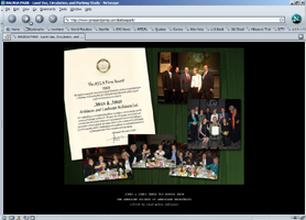
This was something I first produced as an in-house poster on a whim to commemorate Jones & Jones receiving the American Society of Landscape Architects’ first annual ASLA Firm Award, November 2003. One of the Principals had given me some passable-quality photographs taken at the event and said “see if you can use these for anything;” the resulting poster was quite well-received, and later I was asked to adapt the design for both an online announcement of the award on the company’s website and a 5.25" x 4" hard-copy photograph for inclusion in the company’s holiday greeting card. I like the fact that I could make it work at all three scales and in all three contexts.
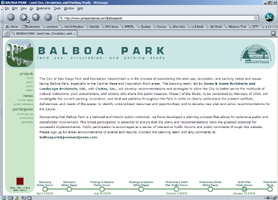
Balboa Park Land Use, Circulation, and Parking Study
October 2003 | client: City of San Diego Park & Recreation Department (for Jones & Jones)
The elements I established for the Study included reports, meeting-announcement flyers and postcards, presentation boards, and a public informational website.
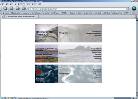
Tropical America
July 2003 | client: Miami Metrozoo (for Jones & Jones)
After a major 160-page design report was delivered to the client, I produced a website version of it, although many elements of it were later removed for general public viewing and it was transformed into a resource page to show the client Jones & Jones’s current project status and products; the website retains the navigation scheme of the original document.
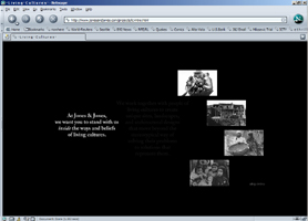
Living Cultures website feature
April 2003 | client: Jones & Jones Architects and Landscape Architects, Ltd
This was a low-key Flash animation leading to a standard project feature page on the Jones & Jones website.
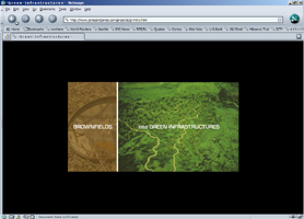
Brownfields into Green Infrastructures
March 2003 | client: Jones & Jones Architects and Landscape Architects, Ltd
This design collaboration with landscape architect Nate Cormier began as a brochure in March of 2003 and was adapted for web use in November, finally appearing as a Flash animation leading to a standard project feature page on the Jones & Jones website.
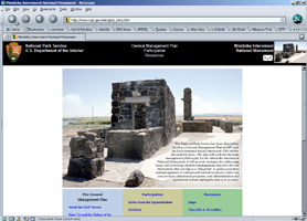
Minidoka Internment National Monument: General Management Plan
October 2002 | client: National Park Service (for Jones & Jones)
I was keen to give this important NPS project a sharp and clean website. Some of its style was adapted from the NPS style guides, but for the most part I was tasked with building something easy to navigate and read, and I think I succeeded.
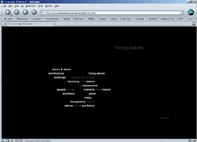
Living Places website feature
November 2002 | client: Jones & Jones Architects and Landscape Architects, Ltd
This Flash animation is a technically simple but conceptually elegant lead-in to a standard project feature page on the Jones & Jones website. This was originally designed as a new presentation style for the website, but the company’s Principals eventually rejected any change to the 5-year-old design of the website and reduced the feature to its brief but pleasant introduction.
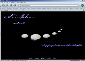
www.kinshan.com
2002 | client: Kinshan, artist
I created this tasteful little site as a favor for friend-of-Chateau-Marmosette Kinshan, who is such a lovely person that I had to make sure her art’s website reflected her own magical touch. Unfortunately sometime since I delivered the built website to her someone’s revised the titling for readability, and I can’t say it conveys the same impression now that it did as I designed it…also, the site as designed was centered onscreen, not upper-left-anchored as it is now. Oh well.
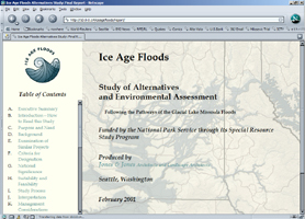
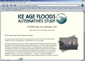
Ice Age Floods Alternatives Study
March 1999 | client: National Park Service (for Jones & Jones)
Once it was decided that the Ice Age Floods study, facilitated by Jones & Jones, should have a sort of “corporate identity” of its own to help catch the public’s attention for what might otherwise seem an academic or specialized project, I designed the logo and set the color palette and titling font which all defined the project’s public look all the way through to the final report which was delivered to the U.S. Secretary of the Interior in September of 2001. I also created the Study’s initial-phase website, which at the conclusion of the Study was replaced with a site presenting the Final Report in webpage form (which I also built). As Graphic Designer I was one of the recipients of the ASLA Honor Award for Communications the project team was given in 2001.
Comments © 2009–2011 Mark Ellis Walker, except as noted, and no claim is made to source imagery noted.